Gainer
Project Format: Semester-long individual course project for SI 582: Interaction Design
Role: UX Designer, UX Researcher, Interaction Designer
Timespan: September 2020 - December 2020 ( 4 months)
Task: Design a solution to facilitate healthy weight gain in underweight individuals.
Design Process
Problem Statement
This class revolved around guiding students through the whole design process, all the way from need-finding to digital prototyping. We were free to decide what our project would be on and what our system would do. I’ve experienced issues with being underweight throughout my life, and have struggled to gain weight every time I tried to. Knowing that this was the problem that I wanted to solve, I set out to design a solution. After conducting five need-finding interviews with people who have experienced issues with gaining weight, I realized that while they all would like to gain weight, they had different issues with doing so. This led me to my problem statement:
Problem: 1.5% of U.S. adults aged 20 and over are underweight, which can cause health issues and psychological insecurity, and staying on track to healthily gain weight can be a difficult task that did not have much available support.
Competitive Analysis
I compared five weight loss/gain applications that would act as both direct and indirect competitors to my tool. I analyzed their strengths and weaknesses in order to see what features may be useful for my tool, and which features may be unnecessary.
Ideation and Brainstorming
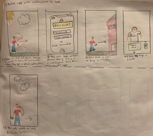
My design solution needed to address the issues that underweight people have experienced while trying to gain weight, and also to be easy to use and access. To begin to explore how to address these issues I turned to paper sketching.


Personas
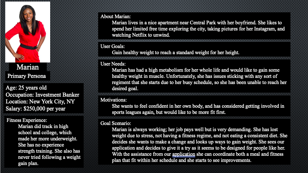
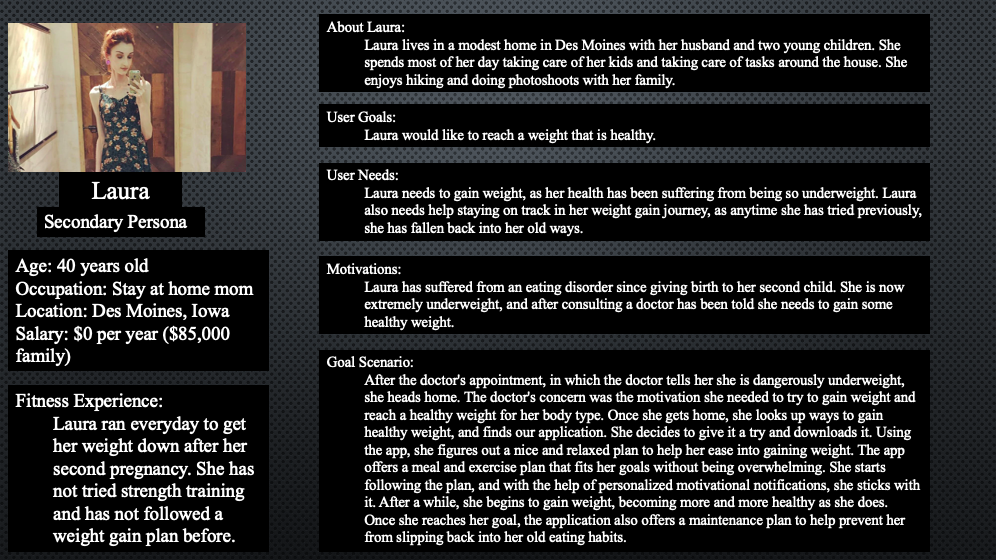
To provide a visual understanding of my consumer base, I generated primary, secondary, and anti personas for potential users of my platform. I intentionally made my personas as diverse as possible, while still making them relevant users. Using these personas and information from interviews, I was able to refine my primary user group: underweight individuals who would like to gain healthy weight, but do not know how to do so effectively.
Paper Prototype
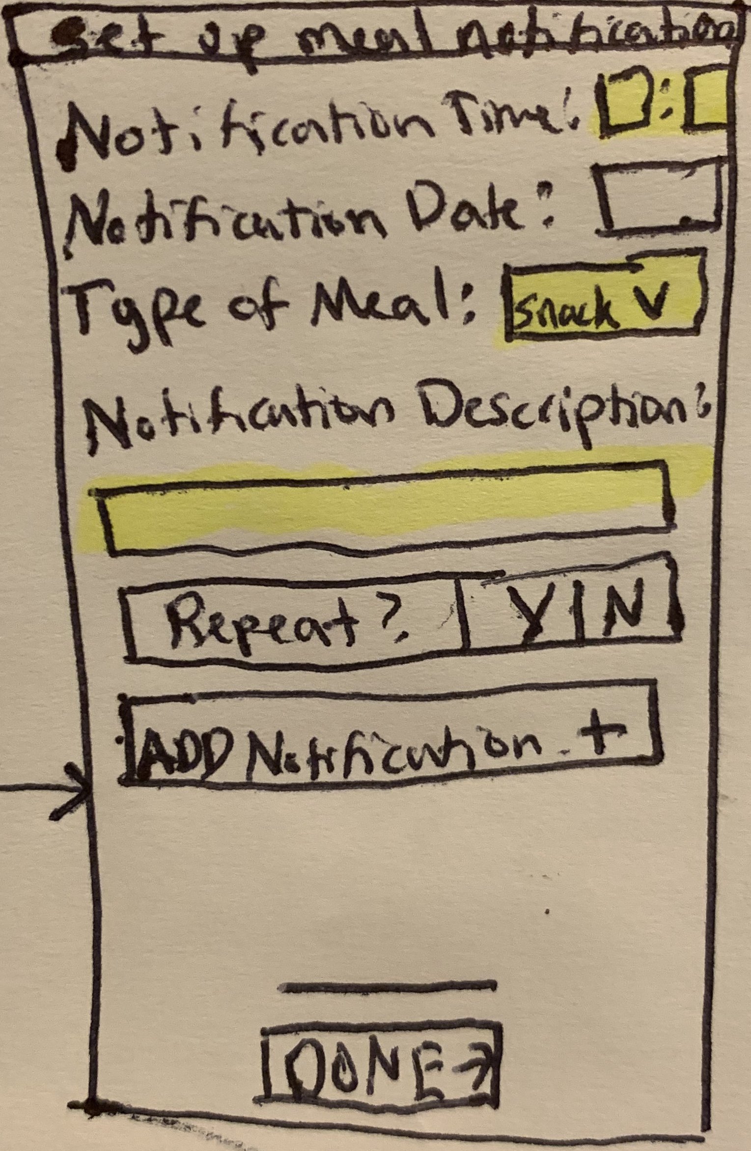
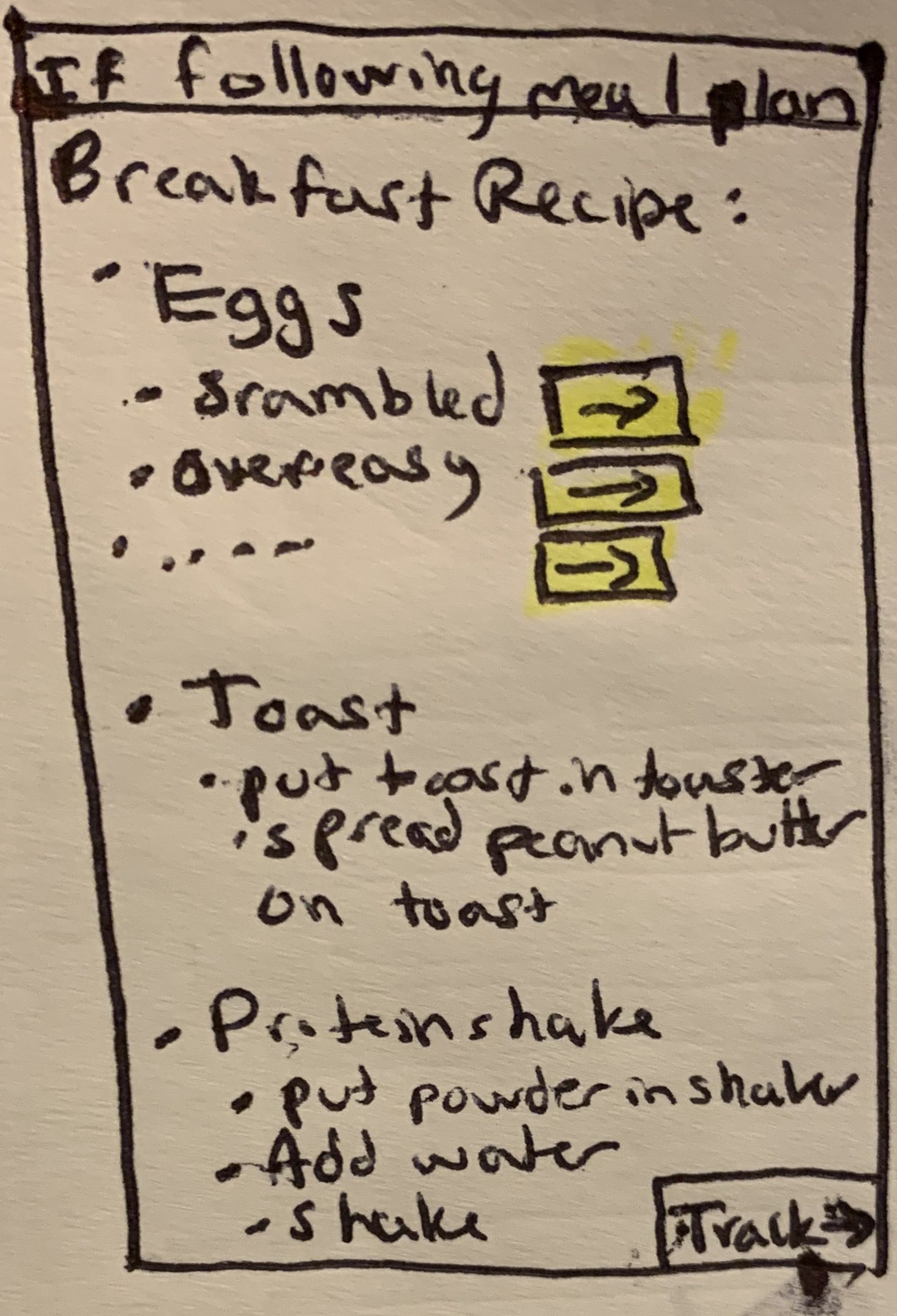
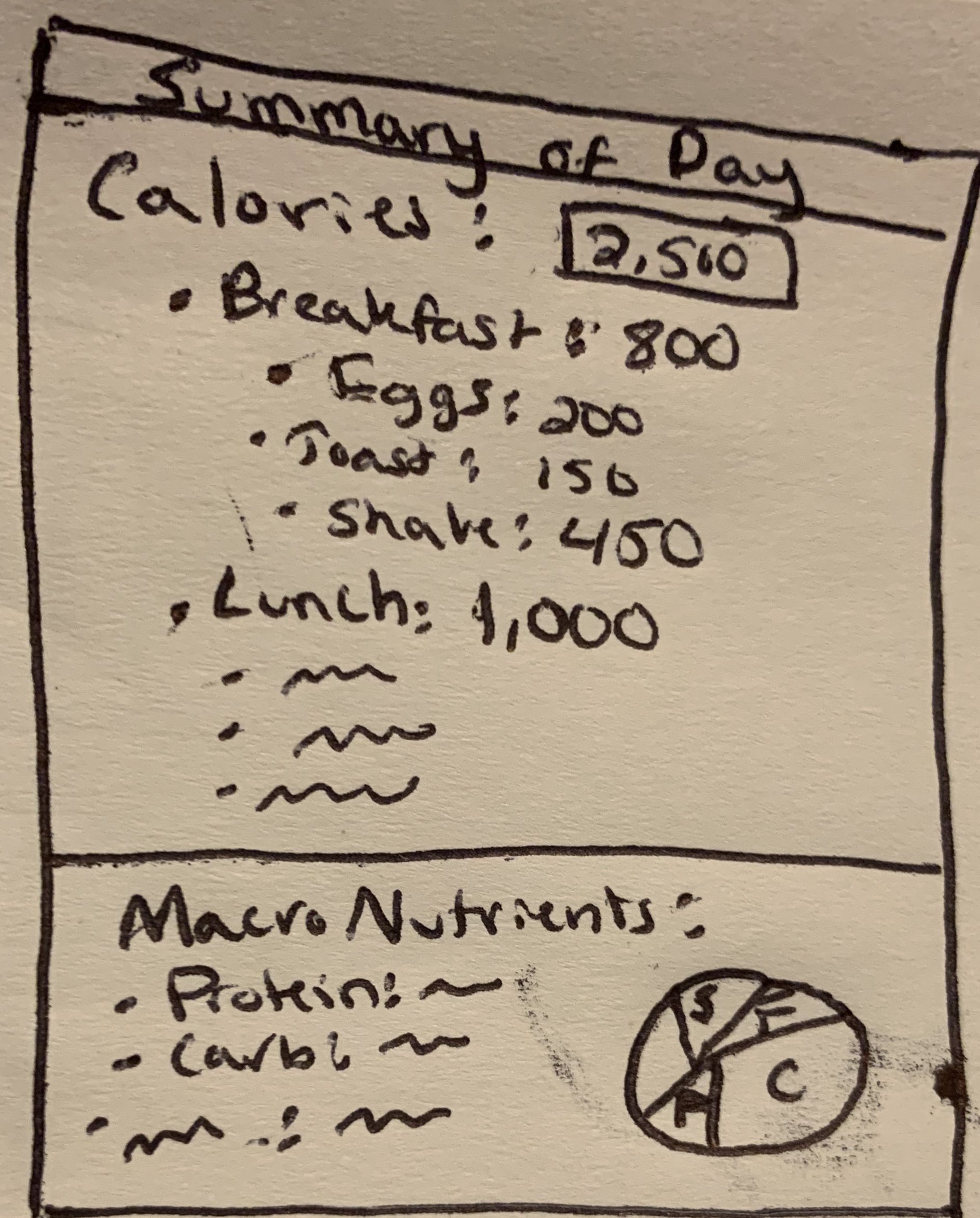
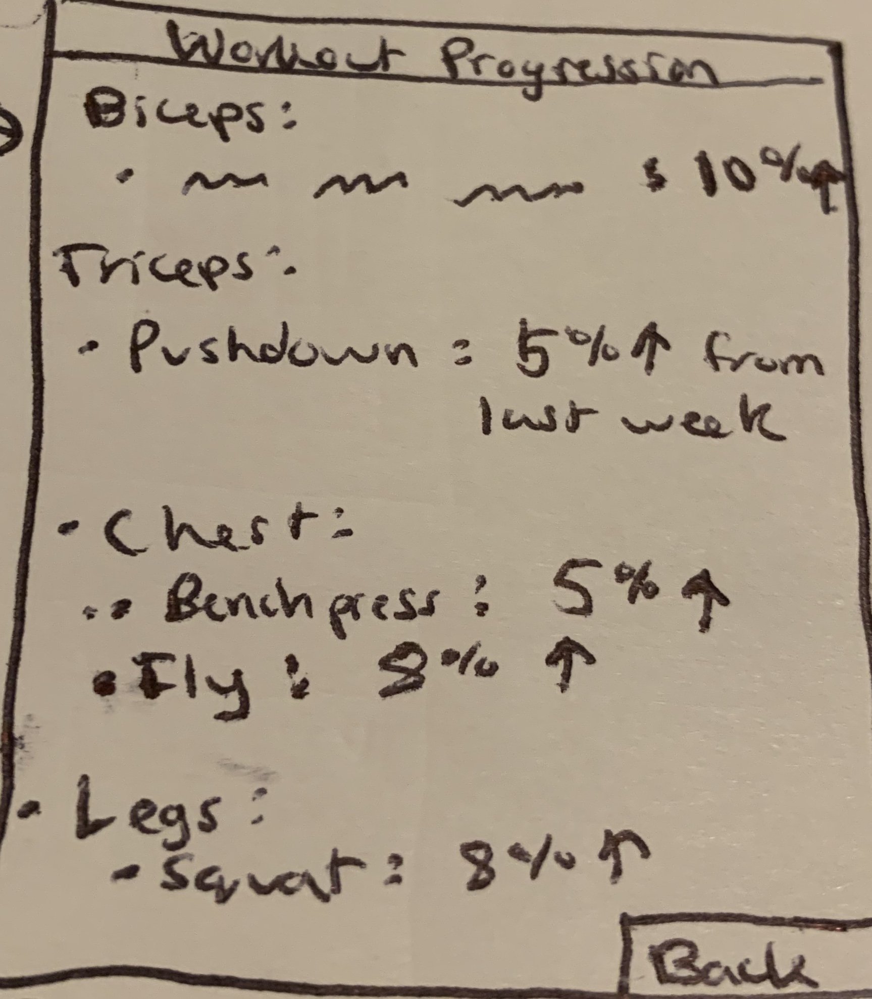
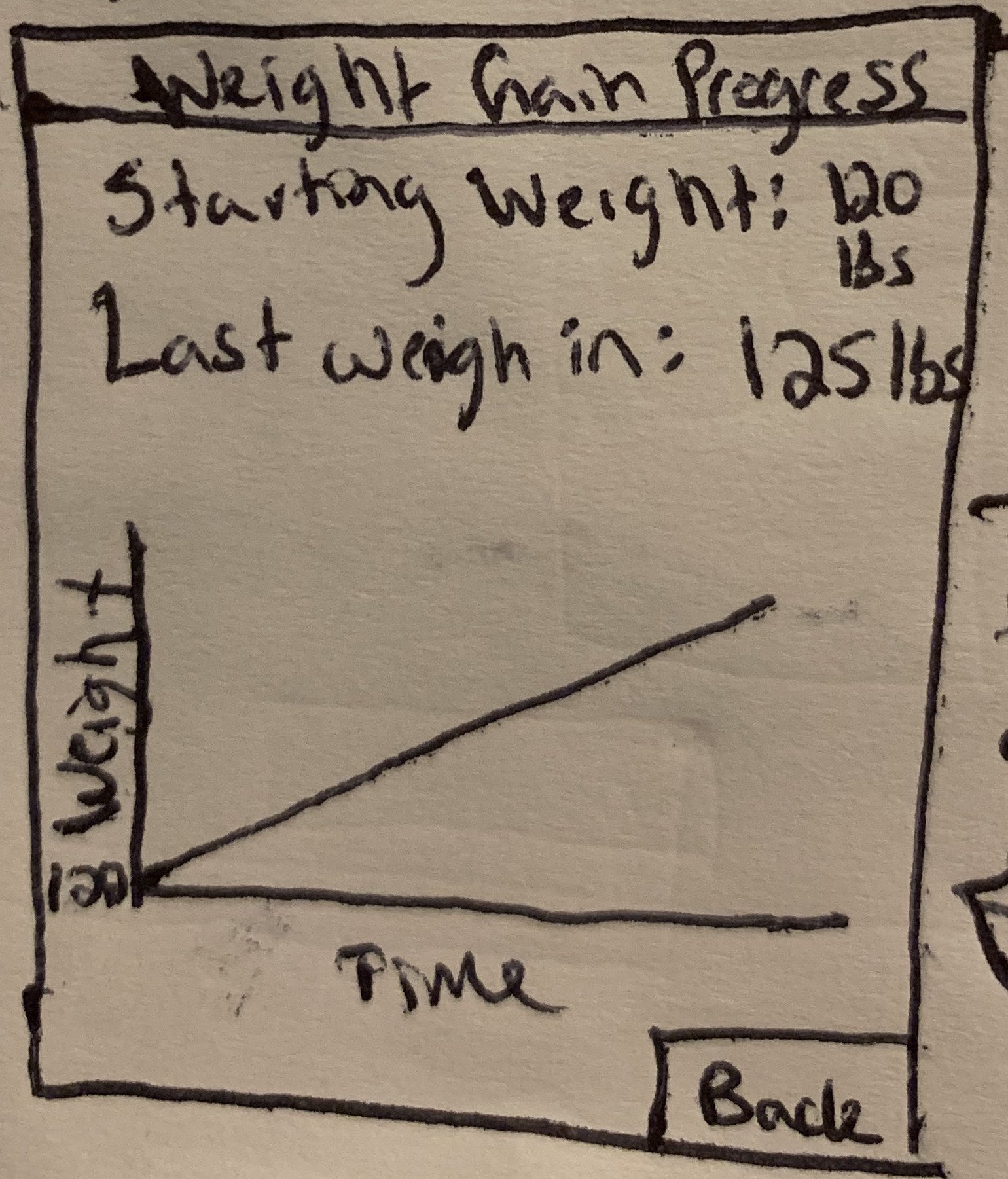
In order to start thinking about how users would interact with my application, I produced a low-fidelity paper prototype which allowed me to gather feedback from my peers through user testing. I received quality feedback from several potential users, with the most common comments pertaining to how to find certain areas of the app. The potential users pointed out issues with finding settings on the homepage, and confusion over where certain things, such as updating their weight, took place. With this feedback in mind, I worked towards developing a mid-fidelity prototype.









Mid-Fidelity Prototype
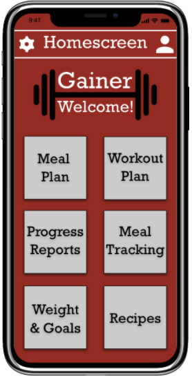
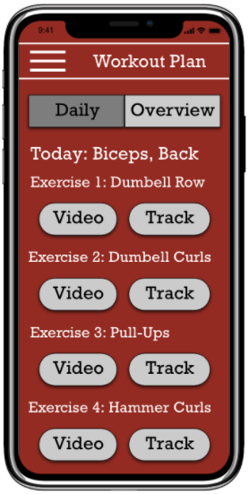
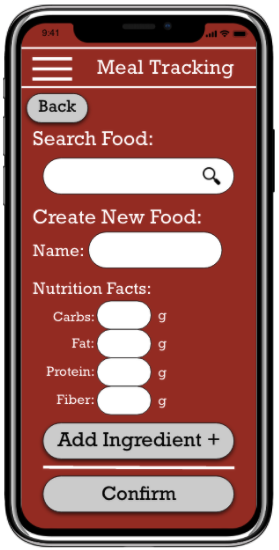
Using Adobe XD, I designed a mid-fidelity prototype with the intention of providing more instruction in my design to guide the user. I chose a color palette that encouraged hunger, and created a logo that represented the importance of exercise in gaining healthy weight.
Discussion
This project served as a valuable experience because it was the first time I went through each stage of the design process and multiple iterations of prototyping. It taught me how useful paper sketches can be, and how to optimize user interactions through paper and digital prototyping.
My goal was to develop a platform that assists underweight individuals in their healthy weight gain journey by providing information and helping them to stay on track. However, it is important to note that while I did my best to include the features that would be most helpful, every underweight individual may have difficulties with different parts of the weight gain process. Therefore, my product may not work the same for everyone, but I did my best to design a platform that could be used by a variety of different underweight people.
In terms of design and interactions, looking back, I would change a few things. First, I would make the analytics portions of the app, such as weight gain progress, more aesthetically appealing. Second, I would update the buttons on my drop-down menu to match the buttons on other pages by giving them a gray background and black lettering. Despite these reflections, I’m still proud of the work I did considering this was my first time taking on a UX project.


